Tech Talks
Here I share what I've learned during my journey as a full-stack developer. This is my space to discuss real-world best practices, design patterns that actually work, project organization and everything I consider essential for writing high-quality code. My goal is to be practical and honest: bring solutions I use every day and that made a difference in my career. If you want to improve your skills and better understand the decisions behind good software development, you're in the right place.
Content Security Policy (CSP) on the Frontend
What is CSP and how it works
CSP (Content Security Policy) is a browser security layer that defines which origins the frontend can use to load scripts, styles, images, fonts, iframes and connections.
It is usually sent via the HTTP Content-Security-Policy header. When the browser receives the page, it applies the rules and blocks everything not allowed by the policy.
Why it matters on the frontend
- Reduces XSS risk because attacker-injected scripts tend to be blocked.
- Controls external calls (connect-src) to avoid data exfiltration to untrusted domains.
- Prevents improper app embedding in third-party iframes via frame-ancestors.
- Defines a minimum security baseline for frontend assets, including production environments.
Practical benefits
- Smaller attack surface for malicious scripts.
- More predictability around what the app can load at runtime.
- Improved security posture for audits and compliance.
- Helps detect suspicious behavior with report-only mode.
Base policy example
Content-Security-Policy:
default-src 'self';
base-uri 'self';
script-src 'self';
style-src 'self';
img-src 'self' data: https:;
font-src 'self' data:;
connect-src 'self' https://api.seu-dominio.com;
frame-ancestors 'none';
object-src 'none';
upgrade-insecure-requests;
In apps with CSS-in-JS or inline scripts, you may need to adjust policy with nonce/hash. Avoid enabling 'unsafe-inline' and 'unsafe-eval' in production whenever possible.
Next.js setup
In Next.js, a common approach is defining CSP in next.config.ts with headers().
// next.config.ts
const csp = [
  "default-src 'self'",
  "script-src 'self'",
  "style-src 'self' 'unsafe-inline'",
  "img-src 'self' data: https:",
  "connect-src 'self' https://api.github.com",
  "frame-ancestors 'none'",
  "object-src 'none'",
].join('; ');

export default {
  async headers() {
    return [
      {
        source: '/(.*)',
        headers: [{ key: 'Content-Security-Policy', value: csp }],
      },
    ];
  },
};
Vite setup
In Vite, the ideal approach is setting headers in the production server (Nginx/CDN). For development, you can add headers in vite.config.ts.
// vite.config.ts
import { defineConfig } from 'vite';

export default defineConfig({
  server: {
    headers: {
      'Content-Security-Policy':
        "default-src 'self'; script-src 'self' 'unsafe-eval'; style-src 'self' 'unsafe-inline'; connect-src 'self' ws: http: https:;",
    },
  },
});
Note: in dev, HMR often requires ws: and in some cases 'unsafe-eval'. In production, tighten the policy.
Other frontend frameworks
In React/Vue/Svelte (SPA), best practice is to configure CSP at the web server, reverse proxy or CDN. Frontend code alone cannot guarantee protection if headers are not sent in the HTTP response.
# exemplo Netlify (_headers)
/*
  Content-Security-Policy: default-src 'self'; script-src 'self'; style-src 'self'; img-src 'self' data: https:;
Nginx example
server {
  listen 443 ssl;
  server_name app.seu-dominio.com;

  root /usr/share/nginx/html;
  index index.html;

  add_header Content-Security-Policy "default-src 'self'; script-src 'self'; style-src 'self'; img-src 'self' data: https:; font-src 'self' data:; connect-src 'self' https://api.seu-dominio.com; frame-ancestors 'none'; object-src 'none'; base-uri 'self';" always;
  add_header X-Content-Type-Options "nosniff" always;
  add_header X-Frame-Options "DENY" always;
  add_header Referrer-Policy "strict-origin-when-cross-origin" always;

  location / {
    try_files $uri /index.html;
  }
}
Summary
CSP does not replace input validation and sanitization, but it significantly reduces the impact of frontend XSS failures. The biggest gain comes from applying a minimal production policy and evolving it iteratively.
Built by: Aureo Bueno - Full-stack web developer
07/04/2026
Hexagonal vs Clean vs Onion Architectures
Overview: what do these 3 architectures solve?
All three emerged to solve the same problem: keep business rules protected from frameworks, databases, UI and technical details that change over time.
In practical terms, they apply Dependency Inversion so the domain remains stable and testable while external adapters can be replaced at lower cost.
How they are usually modeled
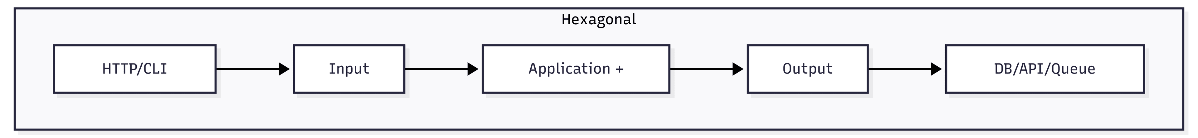
1) Hexagonal (Ports and Adapters)
[Driver Adapter: HTTP/CLI/Test]
            |
         [Input Port]
            |
      [Application + Domain]
            |
        [Output Port]
            |
[Driven Adapter: DB/API/Queue/File]
At the center is application + domain. Inputs and outputs happen through ports (interfaces). Adapters plug into these ports.
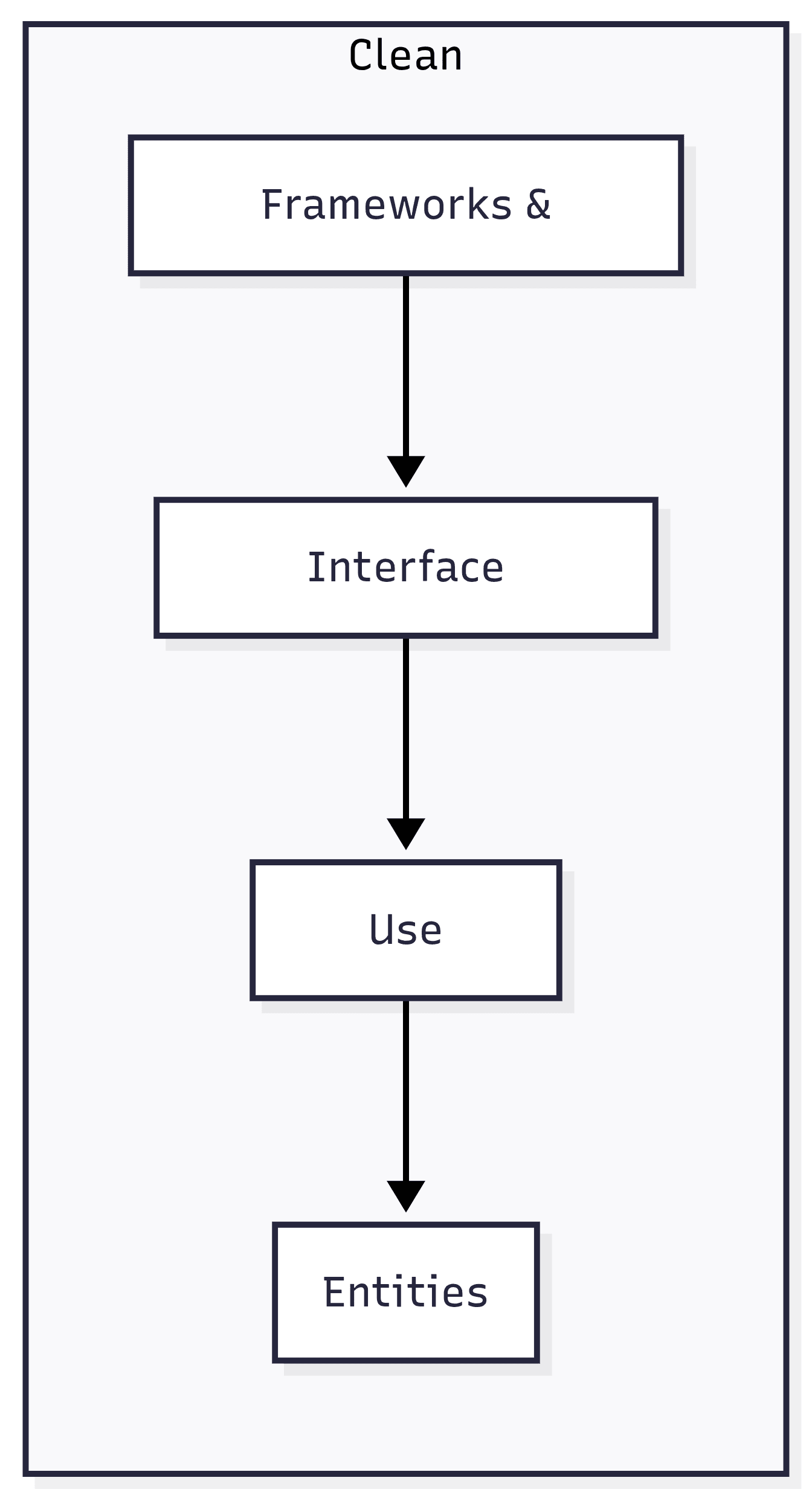
2) Clean Architecture
[Frameworks & Drivers]
      [Interface Adapters]
           [Use Cases]
            [Entities]
It is modeled in concentric circles. Main rule: dependencies always point inward. The more internal it is, the more stable it should be.
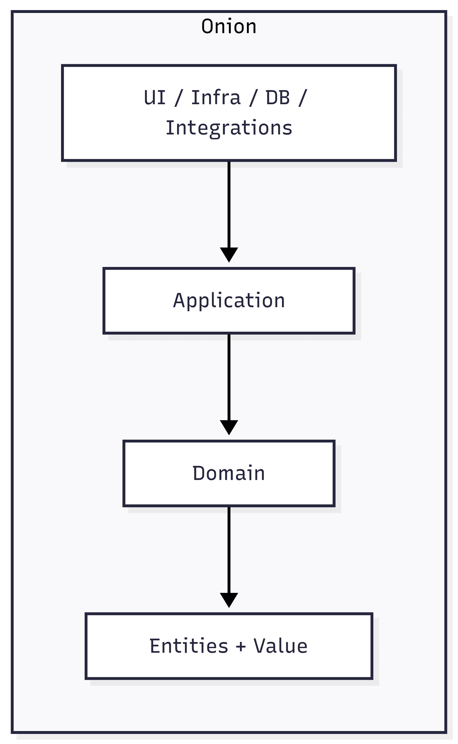
3) Onion Architecture
[UI / Infra / DB / Integrations]
      [Application Services]
      [Domain Services]
 [Entities + Value Objects]
Also uses concentric rings. The domain stays in the core and everything around depends on it. Infrastructure is the outermost ring.
Layers and responsibilities
Hexagonal: logical layers
- Core (Application + Domain): executes use cases, entities, business rules and business policies.
- Input Ports: entry contracts to trigger use cases (e.g., create order, approve payment).
- Output Ports: contracts the core needs to interact outward (persist, publish event, call external API).
- Driver Adapters (input): REST, GraphQL, CLI, acceptance tests; they translate requests to input ports.
- Driven Adapters (output): SQL/NoSQL repositories, HTTP clients, messaging; they implement output ports.
Clean: classic layers
- Entities: the most stable enterprise business rules.
- Use Cases: application business rules, flow orchestration and process validations.
- Interface Adapters: converts external models to internal models and vice versa (controllers, presenters, gateways).
- Frameworks & Drivers: DB, web framework, UI, devices, queues and infrastructure details.
- Dependency rule: outer layers know inner layers, never the opposite.
Onion: common real-world rings
- Core Domain: entities, value objects, invariants and domain events.
- Domain Services: rules that do not naturally belong to a single entity.
- Application Layer: use cases, transaction coordination, authorization and port orchestration.
- Infrastructure Layer: repository implementations, external clients, observability and persistence.
- Presentation/API: endpoints, controllers and handlers only adapting input/output.
Practical differences
- Hexagonal: stronger language around ports/adapters and integration boundaries.
- Clean: stronger language around policy levels and separation of responsibilities by circles.
- Onion: stronger language around domain-centered design with application services around it.
- In practice: many real codebases mix these terms because principles are almost the same.
When to use each one
- Prefer Hexagonal: when your main problem is integrating multiple input channels and several external dependencies.
- Prefer Clean: when you want didactic communication for larger teams and explicit policy separation in layers.
- Prefer Onion: when your domain is rich and you want to reinforce business-rule centrality throughout the design.
- Avoid over-engineering: for small systems, a lightweight version of these principles is usually better than too many layers.
Direct summary
Hexagonal, Clean and Onion belong to the same architectural family: they differ more in how layers are organized and communicated than in core principles.
When choosing between them, the real gain comes from consistency: clear boundaries, clear contracts and infrastructure isolated from business rules.
Built by: Aureo Bueno - Full-stack web developer
28/03/2026
Folder Architecture: Next.js 15 vs Vite + React 18
Next.js 15 - App Router Architecture
Scalable architecture for Next.js 15 with App Router
Folder Structure
src/
├── app/                           # App Router - Routing principal
│   ├── layout.tsx                 # Layout raiz
│   ├── page.tsx                   # Home page
│   ├── (auth)/                    # Route group (não afeta URL)
│   │   ├── login/page.tsx
│   │   └── register/page.tsx
│   ├── dashboard/
│   │   ├── layout.tsx
│   │   ├── page.tsx
│   │   └── [id]/page.tsx          # Dynamic routes
│   └── api/                       # API Routes
│       └── users/route.ts
├── components/
│   ├── ui/                        # Componentes reutilizáveis
│   │   ├── Button/
│   │   │   ├── Button.tsx
│   │   │   ├── Button.test.tsx
│   │   │   └── index.ts
│   │   ├── Card/
│   │   ├── Modal/
│   │   └── index.ts               # Barrel exports
│   ├── layout/                    # Componentes de layout
│   │   ├── Header/
│   │   ├── Footer/
│   │   └── Sidebar/
│   └── features/                  # Componentes específicos de features
│       ├── Auth/
│       └── Dashboard/
├── lib/                           # Lógica complexa e integrações
│   ├── db.ts                      # Database connection
│   ├── auth.ts                    # Auth service
│   └── api-client.ts
├── server/                        # Server-side logic
│   ├── actions/                   # Server actions
│   │   └── user.actions.ts
│   └── services/
│       ├── user.service.ts
│       └── email.service.ts
├── hooks/                         # Custom React hooks
│   ├── useAuth.ts
│   ├── useFetch.ts
│   └── index.ts
├── utils/                         # Utility functions
│   ├── formatters.ts
│   ├── validators.ts
│   └── helpers.ts
├── types/                         # TypeScript types
│   ├── index.ts
│   ├── user.ts
│   └── api.ts
├── styles/                        # Global styles
│   ├── theme.ts                   # Styled-components theme
│   ├── globals.css
│   └── variables.css
├── public/                        # Static assets
│   ├── images/
│   ├── icons/
│   └── fonts/
└── env.example
Folder Explanation
app/
CRITICALContains the entire App Router routing structure. Each folder = one route. Special files: layout.tsx, page.tsx, loading.tsx, error.tsx.
components/ui
HIGHReusable components (Button, Card, Modal). Can be used by multiple features.
components/features
HIGHFeature-specific components (Auth, Dashboard). Used only by their own features.
lib/
HIGHConfiguration and complex services (DB, Auth, API client). Reusable across the app.
server/
HIGHServer-side logic, Server Actions and backend services. Isolated from client code.
hooks/
MEDIUMReusable custom hooks. Encapsulate state and side effects.
utils/
MEDIUMPure utility functions (formatting, validation). No external dependencies.
types/
MEDIUMCentralized TypeScript definitions. Shared interfaces and types.
Essential Best Practices
Use route groups () to organize routes without affecting URLs.
Default to Server Components and use 'use client' only when needed.
Use Server Actions for data mutations (better than API routes in many cases).
Keep lib/ for configuration and server/ for business logic.
Use index files (index.ts) for barrel exports and better structure.
UI components should be context-agnostic.
Centralized TypeScript types reduce duplication.
Quick Comparison
| Feature | Next.js | React |
|---|---|---|
| Routing | Built-in App Router (file-based) | React Router or TanStack Router |
| Server/Client | Server Components by default | Everything is Client-side by default |
| API | Built-in API Routes | External backend calls |
| Deploy | Vercel or any Node host | Any static web server |
| Best for | Full-stack apps with integrated backend | SPAs, PWAs, frontend-only |
💡 Implementation Tips
Import Pattern
Use path aliases in tsconfig.json: "@/*", "@/features/*", "@/shared/*"
Index Files
Always export from index.ts to simplify imports. Example: import { Card } from "@/shared/card"
Do Not Import Between Features
Features should stay independent. Reuse common UI and helpers through shared/.
TypeScript Strict Mode
Enable strict mode in tsconfig.json for maximum type safety
Built by: Aureo Bueno - Full-stack web developer
26/11/2025
React Code Review Best Practices
What is Code Review?
Code Review is an essential practice where other developers review the code to ensure quality, avoid mistakes and strengthen maintainability.
Checklist for Reviewing React Code
- Readability: Clear code, commented when necessary, and consistent with team standards.
- Componentization: Ensure components are small, reusable and have clear responsibilities.
- State and Props: Uses props properly, avoids unnecessary state and respects immutability.
- Performance: Uses techniques such as memoization and avoids unnecessary re-renders.
- Accessibility: Verifies correct use of ARIA attributes, roles and keyboard navigation.
- Style: Consistency in CSS-in-JS/classes usage and adherence to the design system.
- Tests: Covers components and hooks with appropriate unit and integration tests.
Tips for an Efficient Code Review
- Be constructive and focused on code; avoid personal criticism.
- Prioritize understanding the context before suggesting changes.
- Use built-in review tools for quick annotations and discussions.
- Ensure changes do not introduce bugs or regressions.
- Consider scalability and maintainability when suggesting improvements.
Built by: Aureo Bueno - Full-stack web developer
25/11/2025
Design Patterns in React
HOCs (Higher-Order Components)
Higher-Order Components are an advanced pattern that wraps a component to add extra features such as layouts, logging or access control, without modifying the original component. They are a powerful way to reuse logic declaratively while keeping components simple.
function withLog<P>(Component: React.ComponentType<P>) {
  return (props: P) => {
    useEffect(() => console.log(`Componente ${Component.name} montado`), []);
    return <Component {...props} />;
  };
}
Custom Hooks
Custom hooks are functions that encapsulate state and effect logic, improving reuse and code organization. For example, a hook that fetches API data handles loading, response and error state, keeping the consuming component cleaner and more focused on UI.
function useFetchData(url: string) {
  const [data, setData] = useState(null);
  const [loading, setLoading] = useState(false);
  const [error, setError] = useState(null);

  useEffect(() => {
    setLoading(true);
    fetch(url)
      .then(res => {
        if (!res.ok) throw new Error("Erro na requisição");
        return res.json();
      })
      .then(json => setData(json))
      .catch(err => setError(err.message))
      .finally(() => setLoading(false))
  }, [url]);

  return { data, loading, error };
}
Compound Components
Compound Components is a pattern for building flexible composed components that share internal state, allowing subcomponents to communicate and provide a declarative, intuitive API for consumers. A common example is a dropdown where the button controls the menu in an encapsulated way.
function Dropdown({ children }) {
  const [isOpen, setIsOpen] = useState(false);
  const toggle = () => setIsOpen(!isOpen);
  return <div>{children({ isOpen, toggle })}</div>;
}

function DropdownButton({ toggle, label }) {
  return <button onClick={toggle}>{label} ▼</button>;
}

function DropdownMenu({ isOpen, children }) {
  if (!isOpen) return null;
  return <ul>{children}</ul>;
}
Built by: Aureo Bueno - Full-stack web developer
25/11/2025